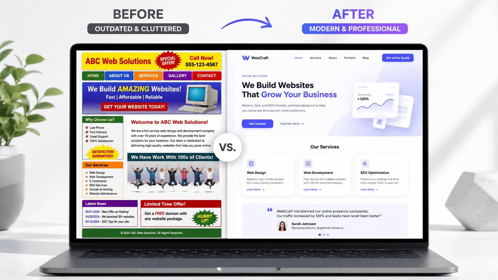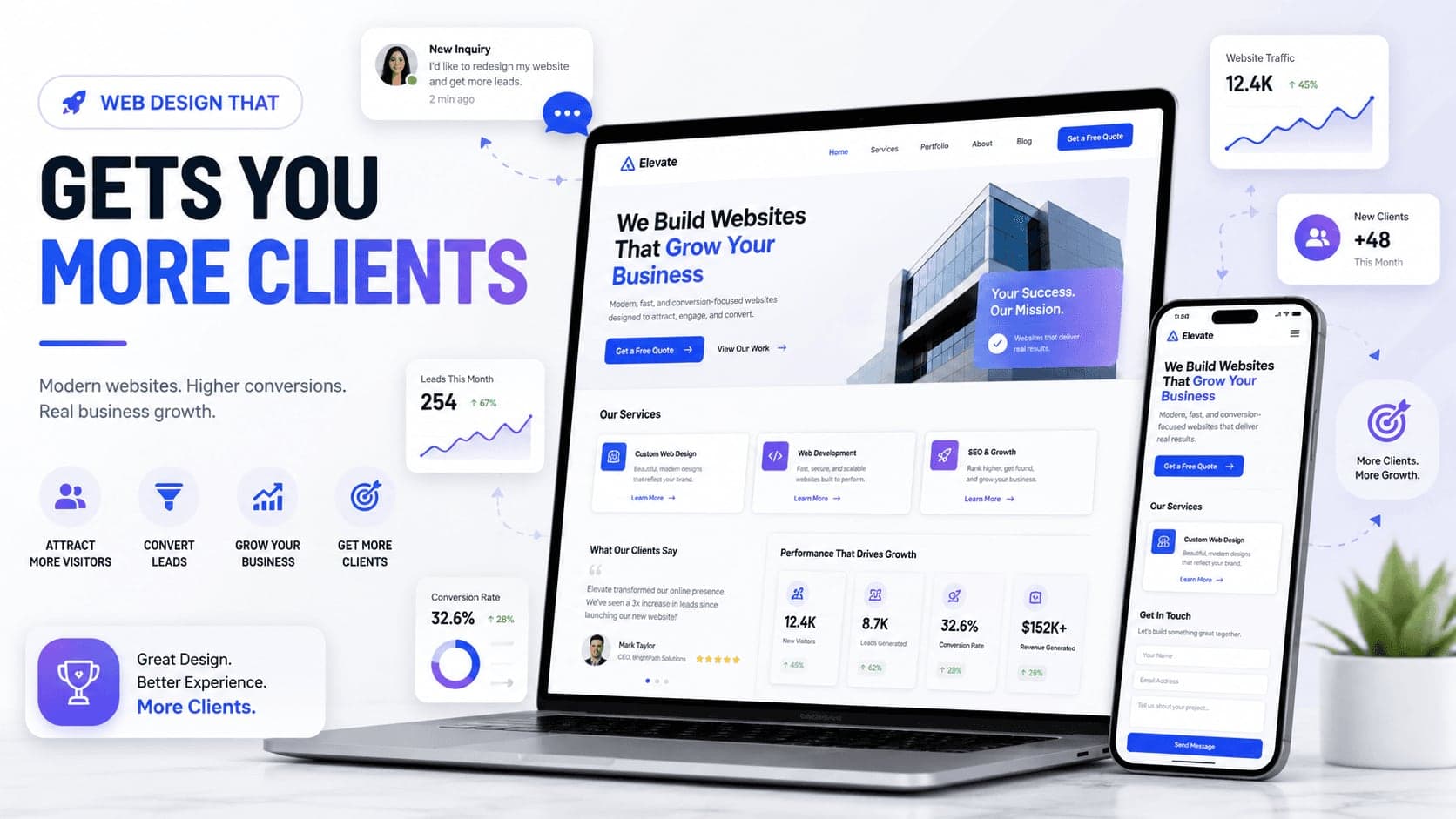
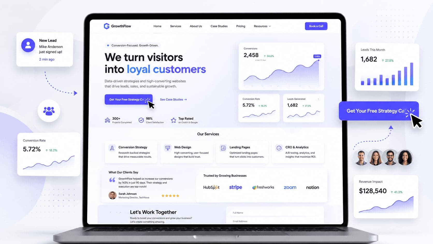
Your homepage is not just the first page of your website. It is often the first place where potential clients decide if your business is worth their time. If the homepage is confusing, slow, cluttered, or unclear, visitors may leave before they ever contact you.
In this article, you will learn how to make your homepage convert better by improving clarity, structure, trust, user experience, and call-to-action placement.
How to Make Your Homepage Convert Better
Your homepage has one main job: help visitors understand your business and guide them toward the next step.
That next step could be booking a call, requesting a quote, sending a message, viewing your work, or learning more about your services.
But many homepages fail because they try to do too much at once.
- They use vague headlines.
- They hide the main call-to-action.
- They show too much information too early.
- They do not explain the value clearly.
- They do not build enough trust.
- They make the visitor work too hard.
A homepage that converts well is not necessarily the most complex one.
It is the one that makes the decision easier for the visitor.
A good homepage should answer the most important questions quickly:
- What do you offer?
- Who is it for?
- Why should I trust you?
- What should I do next?
When your homepage answers these questions clearly, visitors are more likely to stay, understand your value, and contact you.
1. Start With a Clear Hero Section
The hero section is the first thing people see when they land on your homepage.
This section has a huge impact on whether someone stays or leaves.
A strong hero section should instantly explain what your business does and why it matters.
What your hero section should include
A clear headline
Your headline should be specific and easy to understand.
Avoid vague phrases like:
"Creative solutions for modern brands"
This sounds nice, but it does not clearly explain what you do.
A better version would be:
"Modern websites for service businesses that want more client inquiries"
This is stronger because it explains the service, the audience, and the outcome.
A short supporting description
Under the headline, add one or two short sentences that explain your value.
For example:
"We design clean, responsive websites that help your business look professional, build trust, and turn visitors into clients."
This gives the visitor more context without overwhelming them.
A strong call-to-action button
Your main CTA should be visible in the hero section.
Good examples include:
- Book a Free Call
- Request a Quote
- Start a Project
- Get a Website Audit
- View My Work
The CTA should tell people exactly what happens next.
A relevant visual
Use a visual that supports your message.
This could be a website mockup, product image, service preview, portfolio screenshot, or brand photo.
The visual should make your homepage feel more polished, not more crowded.
2. Make the Main Message Easy to Understand
A homepage converts better when the message is simple.
Many businesses try to sound impressive, but they end up sounding unclear.
Visitors should not need to read the entire page to understand what you do.
Your message should answer three questions
What do you do?
Say clearly what service or product you offer.
Who do you help?
Mention the audience you serve.
What result do you create?
Explain the benefit or outcome.
For example:
"We build Framer websites for businesses that want a modern online presence and more qualified leads."
This message is clear because it tells people what you build, who it is for, and why it matters.
Clarity is one of the strongest conversion tools.
If people understand your offer quickly, they are more likely to continue reading.
3. Use One Primary Call-to-Action
A homepage can have multiple buttons, but it should have one main goal.
If you give visitors too many choices, they may take no action.
This is why your homepage should have one primary CTA that appears throughout the page.
Examples of primary CTA goals
- Book a call — Best for service businesses, consultants, designers, and agencies.
- Request a quote — Best for businesses with custom pricing.
- Start a project — Best for creative services and project-based work.
- Get a free audit — Best for web design, marketing, SEO, or consulting services.
- Contact us — Best for general business websites.
Your primary CTA should be repeated in important sections, such as the hero, services section, process section, and final contact section.
The goal is not to pressure the visitor.
The goal is to make the next step obvious.
4. Place Your CTA Where It Matters
A call-to-action button should not appear only once.
Different visitors make decisions at different points.
Some people are ready to contact you immediately. Others need more information first.
That is why CTA placement matters.
Good places to add CTA buttons
- In the hero section — For visitors who already know what they need.
- After the services section — For visitors who understand your offer.
- After testimonials or case studies — For visitors who need proof first.
- In the process section — For visitors who want to know how working with you feels.
- At the bottom of the homepage — For visitors who reach the end and are ready to act.
Your CTA should feel natural, not aggressive.
Each button should appear at the moment when the visitor may be ready to take the next step.
5. Show the Benefits, Not Just the Services
A common mistake is listing services without explaining why they matter.
Visitors do not only care about what you offer.
They care about how it helps them.
Service vs benefit
Service: "Website Design"
Benefit: "A modern website that helps your business look professional and turn visitors into client inquiries."
Service: "Responsive Design"
Benefit: "Your website will look clean and work properly on desktop, tablet, and mobile."
Service: "Framer Development"
Benefit: "You get a fast, modern website that is easy to update and maintain."
A homepage converts better when visitors understand the value behind each service.
Do not only describe what you do.
Explain why it matters.
6. Structure the Homepage Like a Story
A good homepage should guide visitors step by step.
It should not feel like random sections placed one after another.
The structure should move the visitor from awareness to trust to action.
A strong homepage structure can look like this
- Hero section — Explain what you do, who you help, and what action to take.
- Problem section — Show that you understand the visitor's pain point.
- Solution section — Explain how your service solves that problem.
- Services section — Show what you offer.
- Benefits section — Explain why your service matters.
- Portfolio or case studies — Prove that you can deliver quality work.
- Testimonials — Build trust with social proof.
- Process section — Show how easy it is to work with you.
- FAQ section — Remove doubts and answer common questions.
- Final CTA section — Invite the visitor to take action.
This structure works because it follows the way people make decisions.
They need clarity first, then proof, then confidence.
7. Build Trust Early
Trust is one of the biggest factors in conversion.
If people do not trust your business, they will not contact you.
A homepage should start building trust as soon as possible.
Trust elements you can add
- Client testimonials — Short, real testimonials show that other people had a good experience.
- Portfolio examples — Show real work so visitors can judge the quality for themselves.
- Case studies — Explain the problem, process, and result.
- Client logos — If you worked with businesses or brands, show their logos.
- Real photos — Photos of you, your team, your office, or your work can make the website feel more human.
- Numbers and results — Use real numbers if you have them, such as projects completed, years of experience, or measurable improvements.
Trust elements should not be hidden at the bottom of the page.
Bring them closer to the top so visitors feel confident early.
8. Make the Page Easy to Scan
Most visitors do not read every word on a homepage.
They scan.
They look at headings, buttons, images, cards, and highlighted text before deciding if they want to read more.
This means your homepage should be designed for scanning.
How to improve scanability
- Use clear section headings — Each section should be easy to understand at a glance.
- Keep paragraphs short — Long paragraphs can feel overwhelming.
- Use cards for key information — Service cards, benefit cards, and testimonial cards make content easier to digest.
- Highlight important phrases — Use bold text, color, or spacing to make key messages stand out.
- Use visual hierarchy — Important content should appear larger, bolder, or more visually prominent.
A scannable homepage helps visitors understand your value faster.
The faster they understand, the more likely they are to continue.
9. Improve the Visual Hierarchy
Visual hierarchy helps visitors know what to look at first.
Without hierarchy, everything competes for attention.
This makes the page feel confusing.
A homepage with good hierarchy feels clear and intentional.
How to create better hierarchy
- Make the main headline the strongest element — The headline should stand out immediately.
- Use one primary button style — Your main CTA should be visually clear and consistent.
- Use spacing to separate sections — Whitespace helps visitors understand where one idea ends and another begins.
- Keep secondary content smaller — Not everything needs to be bold or large.
- Use contrast carefully — Use color to guide attention, not to decorate everything.
Good hierarchy makes your homepage easier to understand.
And easier understanding usually leads to better conversions.
10. Keep the Design Clean and Focused
A homepage does not convert better because it has more effects.
It converts better when visitors can focus on the message.
Too many animations, colors, popups, banners, and decorative elements can distract people from the main goal.
A clean homepage should avoid
- Too many colors — A limited color palette looks more professional.
- Too many fonts — One or two font families are usually enough.
- Too many animations — Animations should support the experience, not steal attention.
- Crowded sections — Give content enough room to breathe.
- Random visual elements — Every image, icon, and card should have a purpose.
A clean design makes your message feel stronger.
When the design is focused, the visitor can focus too.
11. Make the Mobile Version Strong
Your homepage needs to convert on mobile, not only on desktop.
Many visitors will see your website on a phone first.
If the mobile version feels broken, crowded, or hard to use, they may leave quickly.
A strong mobile homepage should have
- Readable text — Visitors should not need to zoom in.
- Easy-to-tap buttons — CTA buttons should be large enough and spaced properly.
- Natural section stacking — The page should feel designed for mobile, not just squeezed into a smaller screen.
- Shorter text blocks — Mobile users need content that is easy to scan.
- Fast loading — Mobile users are less patient with slow pages.
- Simple forms — If you include a form, keep it short and easy to complete.
A strong mobile experience can directly affect how many people contact you.
12. Use Testimonials Strategically
Testimonials are powerful because they reduce doubt.
But many websites use them too late or display them without context.
A good testimonial section should support the decision-making process.
Better testimonials should mention
- The problem — What was the client struggling with before?
- The experience — What was it like to work with you?
- The result — What improved after the project?
- The name and role — A testimonial feels more real when it includes a person's name, role, or business.
A generic testimonial like:
"Great service, highly recommend"
is not as strong as:
"Our new website made our business look more professional, and we started getting more serious inquiries within the first month."
Specific testimonials are more convincing.
13. Add a Process Section
A process section can improve conversions because it removes uncertainty.
Many visitors are interested, but they hesitate because they do not know what happens after they contact you.
A simple process section helps them feel more comfortable.
A web design process could include
- Discovery — You understand the business, goals, audience, and project needs.
- Strategy — You plan the website structure, content direction, and user journey.
- Design — You create the visual direction and page layouts.
- Development — You build the website in Framer or another platform.
- Launch — You test, optimize, and publish the website.
A clear process makes your service feel more professional and easier to trust.
14. Remove Friction From the Contact Section
The contact section is where conversion happens.
If this section is too complicated, people may stop before submitting the form.
A high-converting contact section should feel simple and low-pressure.
How to improve your contact section
- Use a clear headline — For example: "Ready to improve your website?"
- Keep the form short — Ask only for the information you need.
- Explain what happens next — For example: "After you send the message, I'll reply with the next steps."
- Add alternative contact options — Some people prefer email, phone, or social media.
- Make the button specific — Instead of "Submit," use Send Message, Request a Quote, Book a Call, or Start My Project.
The easier the contact section feels, the more likely people are to use it.
15. Use Better Website Copy
Design can attract attention, but copy helps people make decisions.
If your homepage text is vague, generic, or too focused on yourself, it may not convert well.
Good homepage copy should be clear, specific, and focused on the visitor.
How to improve homepage copy
- Talk about the client's problem — Show that you understand what they are struggling with.
- Explain the outcome — Tell them what changes after working with you.
- Use simple language — Avoid unnecessary jargon.
- Be specific — Specific copy feels more trustworthy than generic claims.
- Focus on benefits — Explain why your service matters.
For example, instead of saying:
"We offer professional web design services"
say:
"We design modern websites that help service businesses build trust and get more client inquiries."
The second version is clearer and more conversion-focused.
16. Answer Common Objections
Visitors may be interested but still have doubts.
A strong homepage can answer these doubts before they stop people from taking action.
Common objections include
- How much does it cost? — You do not always need to show exact pricing, but you can explain how pricing works.
- How long does it take? — Give a general timeline if possible.
- What do I need to provide? — Explain what the client needs to prepare.
- Will I be able to update the website? — This is important for clients who worry about maintenance.
- What happens after launch? — Mention support, guidance, or next steps.
A short FAQ section can help remove hesitation and increase conversions.
17. Make Performance a Priority
A homepage that loads slowly can lose visitors before they even see your message.
Performance is part of user experience.
A fast homepage feels smoother, more professional, and easier to trust.
Ways to improve homepage performance
- Optimize images — Use compressed images and modern formats.
- Avoid unnecessary scripts — Too many tools can slow down the page.
- Keep animations lightweight — Animations should not hurt loading speed.
- Use efficient layouts — A clean structure is easier to optimize.
- Test the mobile version — Mobile performance is extremely important.
A fast homepage helps visitors reach your message without frustration.
18. Track What Visitors Do
You cannot improve conversions properly if you do not understand how people use your homepage.
Analytics can help you see what works and what needs improvement.
Useful things to track
- Button clicks — See which CTA buttons people actually click.
- Form submissions — Measure how many visitors become inquiries.
- Scroll depth — Understand how far people move down the page.
- Popular sections — See what content gets attention.
- Drop-off points — Find where people leave.
Conversion improvement is not only about design.
It is also about testing, learning, and adjusting.
19. Common Homepage Mistakes That Hurt Conversions
Many homepages lose potential clients because of avoidable mistakes.
Common mistakes include
- Vague headline — Visitors do not understand what the business offers.
- Weak CTA — The next step is not clear.
- Too much information at once — The page feels overwhelming.
- No trust elements — Visitors do not see proof.
- Poor mobile experience — Phone users leave quickly.
- Slow loading speed — Visitors get frustrated before reading.
- Generic copy — The website does not speak directly to the target audience.
- Hidden contact section — People have to search for how to contact the business.
Fixing these issues can make the homepage much more effective.
20. Final Thoughts
Your homepage is one of the most important pages on your website.
It introduces your business, explains your value, builds trust, and guides visitors toward action.
A homepage that converts better is usually not more complicated.
It is clearer.
It has a stronger hero section.
It uses better calls-to-action.
It builds trust earlier.
It explains benefits, not just services.
It is easy to scan.
It works well on mobile.
It removes confusion and makes the next step obvious.
If your homepage is not bringing enough inquiries, the problem may not be your service.
The problem may be how your website presents it.
A better homepage can help visitors understand your value faster and feel more confident about contacting you.
That is what conversion-focused design is all about.