
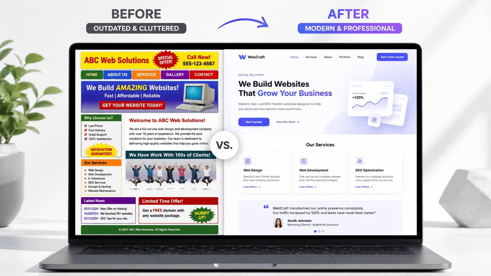
Your website does not need to be complicated to look professional. In most cases, a professional website is not about adding more effects, more colors, or more sections. It is about clarity, consistency, spacing, trust, and making the visitor feel like your business knows what it is doing.
In this article, you will learn practical ways to make your website look more professional, build more trust with visitors, and create a stronger first impression for your business.
How to Make Your Website Look More Professional
Your website is often the first impression people have of your business.
Before they contact you, book a service, request a quote, or visit your location, they usually check your website. And in just a few seconds, they decide if your business feels professional or not.
A professional website does not only look better. It makes your business feel more trustworthy, more organized, and more serious.
The good news is that making a website look professional does not always mean making it more complex.
Actually, many websites look unprofessional because they try to do too much.
- Too many colors.
- Too many fonts.
- Too many sections.
- Too many effects.
- Too many unclear messages.
A modern, professional website should feel clear, intentional, and easy to use.
Here are the most important things that can instantly improve the professional look of your website.
1. Start With a Clear First Section
The first section of your website is extremely important.
This is where visitors decide if they want to keep reading or leave.
A professional website should immediately explain what the business does, who it helps, and what action the visitor should take next.
What your first section should include
A clear headline
Your headline should explain your offer in a simple and direct way.
Instead of saying:
"Digital solutions for your future"
say something clearer:
"Modern websites for service businesses that want more clients"
The second version is more specific and easier to understand.
A short supporting description
Under the headline, add one or two short sentences that explain the value of your service.
This should not be a long paragraph. It should quickly tell visitors why your offer matters.
A strong call-to-action button
A professional website should guide visitors toward the next step.
Examples of good CTA buttons include:
- Book a Call
- Request a Quote
- Start a Project
- View Our Work
- Contact Us
The button should be easy to see and easy to understand.
A clean visual
Use an image, website mockup, product photo, or simple graphic that supports your message.
The visual should not distract from the headline. It should make the section feel more polished.
2. Use Fewer Colors
One of the fastest ways to make a website look more professional is to reduce the number of colors.
Many unprofessional websites use too many colors at the same time. This makes the design feel messy and inconsistent.
A professional website usually has a simple color system.
A good color system can include
- One main color — This is your primary brand color. It can be used for buttons, highlights, icons, and important elements.
- One accent color — This can be used carefully to create contrast or visual interest.
- Neutral colors — White, black, gray, and soft background tones help the design feel clean and balanced.
- Consistent usage — The same color should mean the same thing across the website.
For example, if blue is used for primary buttons, keep using blue for primary buttons everywhere.
Consistency makes your website feel more intentional.
3. Choose Better Typography
Typography has a huge impact on how professional a website feels.
Even if the layout is simple, good typography can make the website look premium.
Bad typography, on the other hand, can make even a good design feel cheap.
What makes typography look professional
- Use one or two fonts — Most websites do not need more than two fonts. One font can be used for headings and another for body text. In many cases, one strong font family is enough.
- Create clear size differences — Headings should be larger and stronger than paragraphs. Subheadings should help organize the content. Paragraphs should be easy to read.
- Keep paragraphs short — Large blocks of text are harder to read and can make the website feel overwhelming. Short paragraphs make the website feel cleaner and more modern.
- Use enough line spacing — Text needs room to breathe. If lines are too close together, the content feels crowded.
Professional typography is not only about the font. It is about hierarchy, spacing, and readability.
4. Improve Your Spacing
Spacing is one of the most underrated parts of professional web design.
A website can look much more premium just by using better spacing.
When elements are too close together, the design feels crowded. When spacing is consistent, the website feels calm, clean, and organized.
Where spacing matters most
- Between sections — Each major section should have enough vertical space so the page does not feel compressed.
- Around text — Headlines, paragraphs, and buttons should not feel glued together.
- Inside cards — Service cards, testimonial cards, and feature cards need internal padding.
- Around images — Images should have enough room so they do not feel randomly placed.
Good spacing makes the website easier to scan and more pleasant to use.
A professional website gives content room to breathe.
5. Make Your Layout More Consistent
Consistency makes a website feel professional.
If every section has a different style, different spacing, different button shape, and different typography, the website starts to feel chaotic.
A professional website should feel like one connected system.
Things that should stay consistent
- Button style — Use the same shape, size, color, and hover style for similar buttons.
- Card design — Service cards, blog cards, and testimonial cards should follow a similar visual style.
- Section spacing — Keep consistent spacing above and below sections.
- Image style — Use images that feel like they belong together.
- Icon style — Do not mix too many icon styles. Choose one style and use it consistently.
Consistency helps visitors feel that your business is organized and reliable.
6. Use High-Quality Images
Images can make or break the look of a website.
Low-quality images, random stock photos, stretched visuals, or blurry graphics can make a website feel unprofessional very quickly.
A modern website should use images intentionally.
Better image choices include
- Real photos — Real photos of your team, location, product, or work can build trust.
- Professional mockups — If you are showing digital work, use clean device mockups or project previews.
- Consistent image style — Images should have a similar lighting, color tone, or composition.
- Optimized file sizes — High-quality images should still load quickly.
- Avoid generic stock photos — Images that look too fake or overused can reduce trust.
Your images should support your message, not just fill empty space.
7. Make Your Website Easy to Read
A professional website should not make people work hard to understand it.
If the text is too small, too long, too vague, or too hard to scan, visitors may leave.
Readability is a huge part of professionalism.
How to improve readability
- Use clear headings — Headings help visitors understand what each section is about.
- Break text into smaller parts — Short paragraphs are easier to read than large blocks of text.
- Use simple language — Avoid complicated words when simple ones work better.
- Highlight important ideas — Use bold text, cards, or visual hierarchy to make key points stand out.
- Keep enough contrast — Text should be easy to read against the background.
A website that is easy to read feels more thoughtful and more professional.
8. Add Trust Elements
A professional website should not only say that a business is good.
It should prove it.
Trust elements help visitors feel more confident before they contact you.
Trust elements you can add
- Testimonials — Short reviews from real clients can make a big difference.
- Case studies — Show the problem, the solution, and the result.
- Portfolio examples — Let visitors see the quality of your work.
- Client logos — If you worked with recognizable businesses, show them.
- Statistics — Use real numbers when possible, such as projects completed, years of experience, or client results.
- Certifications or awards — These can help if they are relevant.
Trust elements reduce doubt.
And when people trust your website, they are more likely to trust your business.
9. Use Clear Call-to-Action Buttons
A website can look professional but still fail if visitors do not know what to do next.
That is why call-to-action buttons are important.
A good CTA makes the next step obvious.
Examples of clear CTA buttons
- Book a Free Call — Good for consultants, agencies, and service businesses.
- Get a Quote — Good for custom services.
- Start a Project — Good for creative and design services.
- View Portfolio — Good when visitors need proof before contacting you.
- Send a Message — Good for simple contact forms.
Avoid vague buttons like:
- "Learn More" everywhere
- "Click Here"
- "Submit"
Your CTA should be specific and action-focused.
10. Keep the Navigation Simple
Navigation should help visitors move through the website easily.
A professional website does not need a complicated menu.
In many cases, fewer navigation items make the website easier to use.
Good navigation items may include
- Home — The main starting point.
- Services — Where visitors understand what you offer.
- Work or Portfolio — Where visitors see proof.
- About — Where they learn who is behind the business.
- Blog or Resources — Where they can read helpful content.
- Contact — Where they can take action.
The menu should be clear, short, and easy to understand.
If visitors cannot find what they need, the website feels less professional.
11. Make the Mobile Version Look Just as Good
A professional website needs to work well on mobile.
Many businesses focus too much on the desktop version and forget that a lot of visitors will experience the website from their phone.
A poor mobile version can make the entire business feel less serious.
What makes a mobile website professional
- Text is easy to read — Visitors should not need to zoom in.
- Buttons are easy to tap — Buttons should not be too small or too close together.
- Sections stack naturally — The layout should feel designed for mobile, not forced into mobile.
- Images fit properly — Images should not be cut in strange ways.
- Forms are simple — Contact forms should be easy to complete on a phone.
The mobile version should feel just as intentional as the desktop version.
12. Remove Unnecessary Elements
Sometimes the best way to make a website look more professional is to remove things.
A clean website often feels more premium than a crowded one.
Things you may need to remove
- Extra animations — Animations should support the experience, not distract from it.
- Too many colors — A limited palette usually looks more professional.
- Long paragraphs — Shorter content is easier to read.
- Repeated information — Avoid saying the same thing in every section.
- Weak images — Remove visuals that do not add value.
- Random icons — Icons should have a purpose and a consistent style.
Every element on your website should have a reason to exist.
If it does not help the visitor understand, trust, or contact you, it may not need to be there.
13. Create a Strong Visual Hierarchy
Visual hierarchy means organizing content so visitors know what to look at first.
A website without hierarchy feels confusing because everything competes for attention.
A professional website guides the eye naturally.
How to create better visual hierarchy
- Make important headlines larger — The most important message should stand out.
- Use contrast — Important buttons and sections should be visually clear.
- Group related elements — Content that belongs together should be visually connected.
- Use whitespace — Empty space helps important elements stand out.
- Avoid making everything bold — If everything is emphasized, nothing feels important.
Good hierarchy helps visitors scan the website quickly and understand the message faster.
14. Improve Your Contact Section
The contact section is where interest turns into action.
If the contact section feels weak, confusing, or hidden, you may lose potential clients.
A professional contact section should be simple and reassuring.
A strong contact section can include
- A clear headline — For example: "Let's build something great together."
- A short explanation — Tell visitors what happens after they contact you.
- A simple form — Ask only for the information you actually need.
- Email address — Some visitors prefer direct email.
- Phone number — Useful for local or service businesses.
- Social links — Helpful if your audience connects with you on social platforms.
- Response expectation — For example: "I usually reply within 24 hours."
Make the final step feel easy and low-pressure.
15. Use a Consistent Brand Voice
Professional design is not only visual.
The way your website sounds also matters.
Your copy should feel consistent across the website.
Your website voice should be
- Clear — People should understand what you mean quickly.
- Confident — Avoid sounding unsure or too generic.
- Helpful — Focus on the visitor's problem and goal.
- Human — Do not write like a robot or a corporate template.
- Specific — Specific copy builds more trust than vague phrases.
For example, instead of saying:
"We provide high-quality solutions"
say:
"We design websites that help service businesses look professional and get more client inquiries."
The second version feels more real and useful.
16. Make Your Website Feel Intentional
A professional website feels intentional.
This means every section, button, image, and text block has a purpose.
Nothing feels random.
Ask yourself these questions
- Does this section help the visitor understand my offer? If not, simplify it or remove it.
- Does this image support the message? If not, replace it.
- Is this CTA clear? If not, rewrite it.
- Is this section easy to scan? If not, improve the layout.
- Does the website feel consistent? If not, align the colors, typography, spacing, and components.
A professional website is not just designed.
It is carefully thought through.
17. Final Thoughts
Making your website look more professional is not about adding more design effects.
It is about making better decisions.
- Clear message.
- Better spacing.
- Consistent colors.
- Strong typography.
- High-quality images.
- Simple navigation.
- Trust elements.
- Clear call-to-action buttons.
- A strong mobile experience.
When these elements work together, your website feels more polished, credible, and trustworthy.
A professional website can change how people see your business.
It can make you look more established.
It can help visitors understand your value faster.
And it can make potential clients feel more confident about contacting you.
Your website does not need to be complicated.
It needs to be clear, consistent, and built with purpose.
That is what makes it look professional.