//01
Designing the Editor's Stage
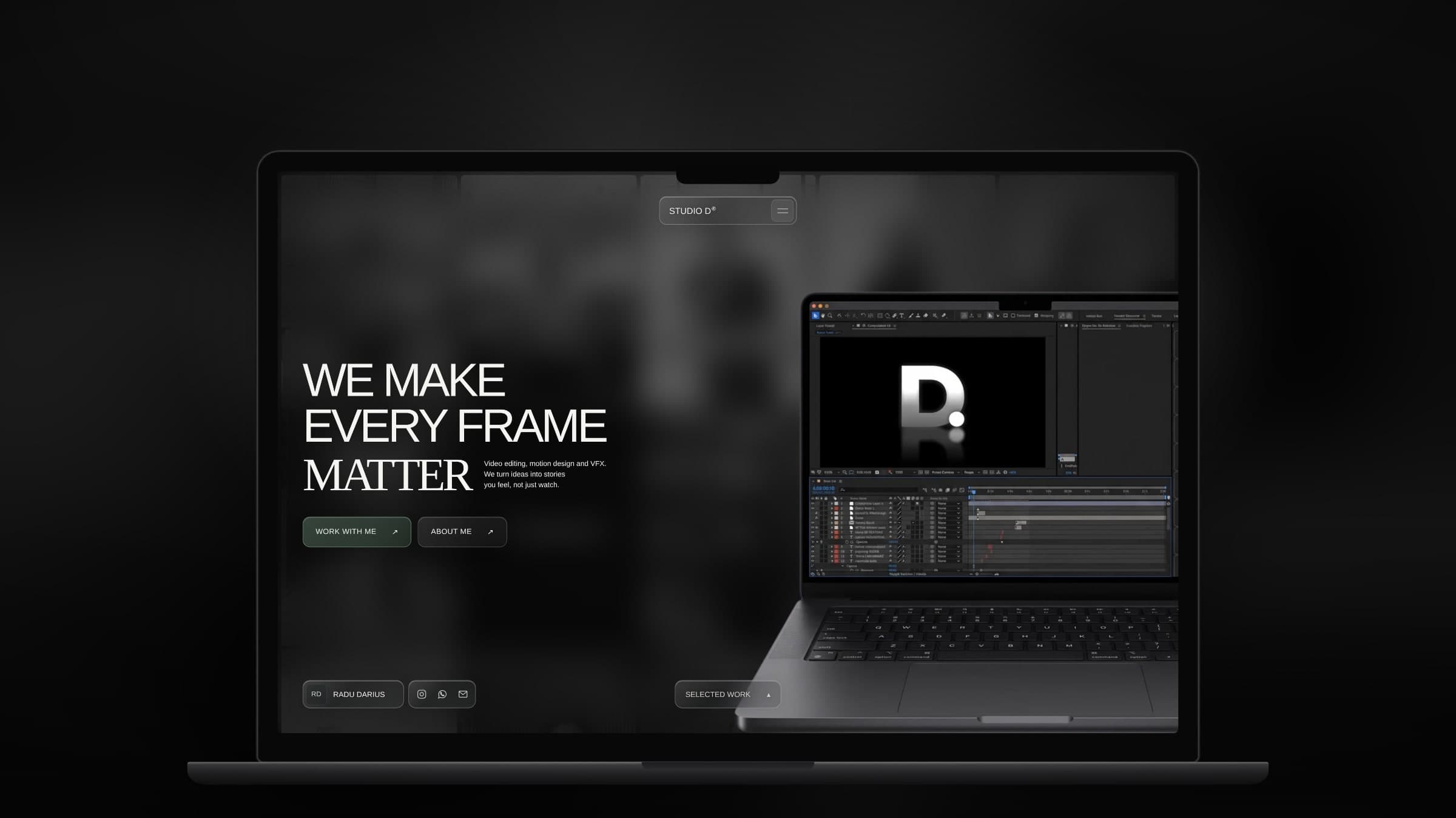
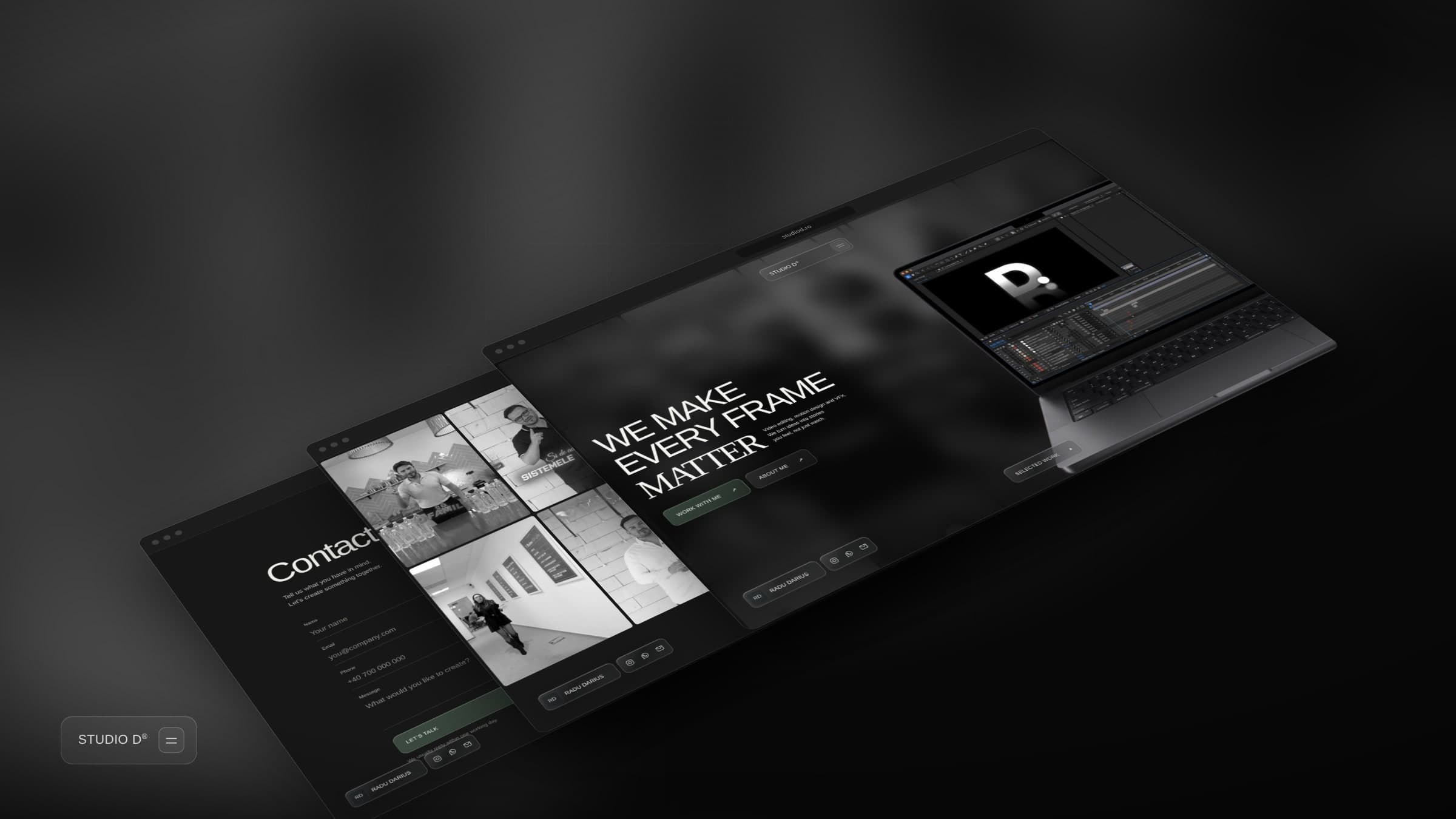
We built a dark, high-impact landing page that captures attention in the first three seconds — because that's exactly what Studio D promises to do for every client.
Overview
Studio D is a video editing service built around one promise — send the footage, get back content that keeps people watching. The brief was clear: design a site that matches the energy of the work it sells, converts on first impression, and runs as a real business tool after launch.
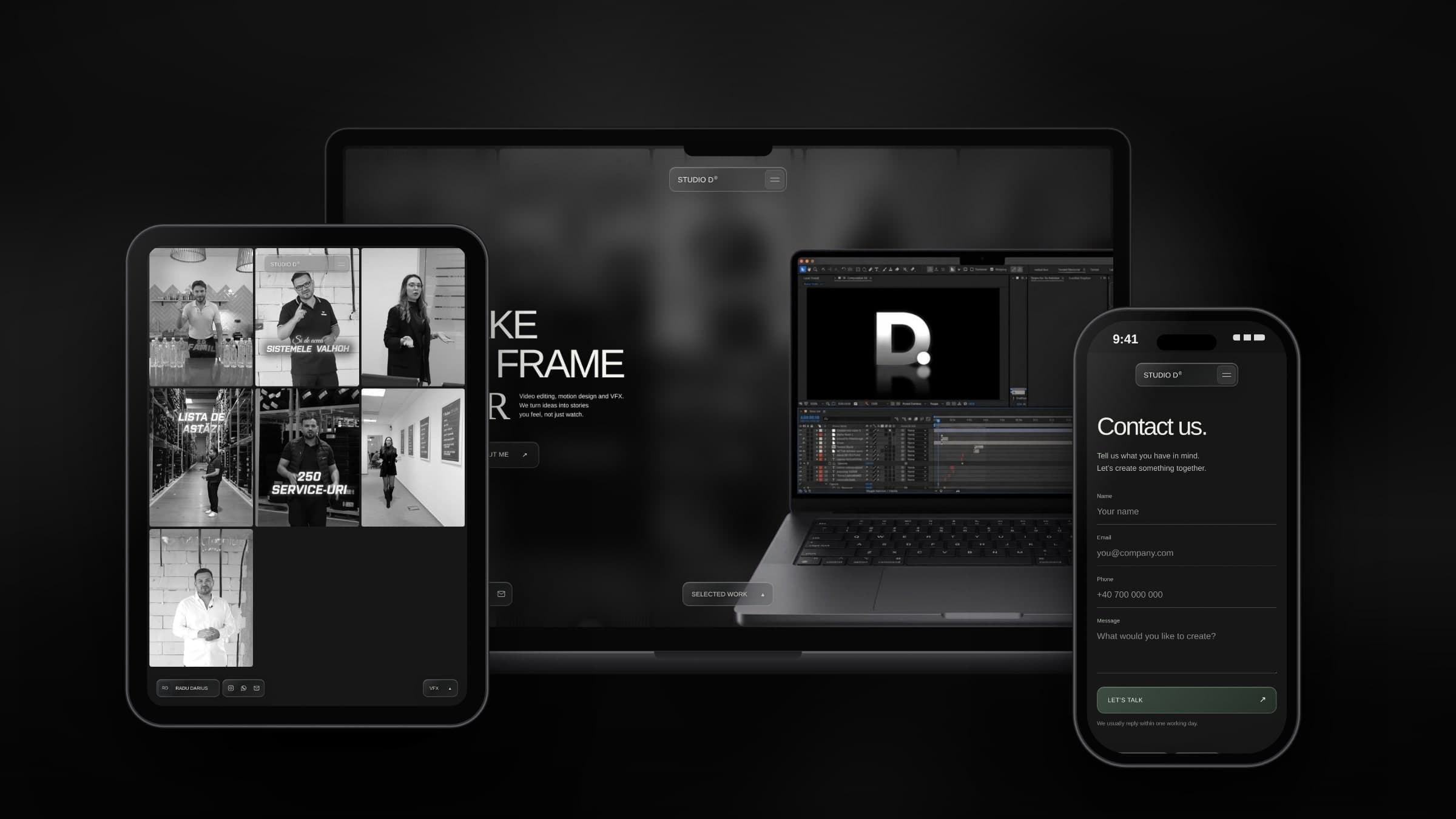
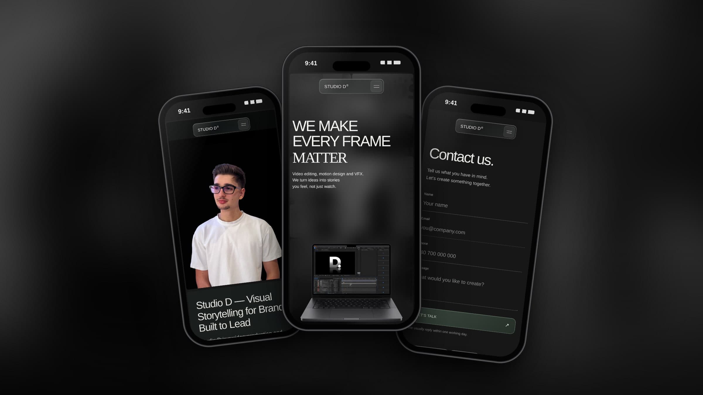
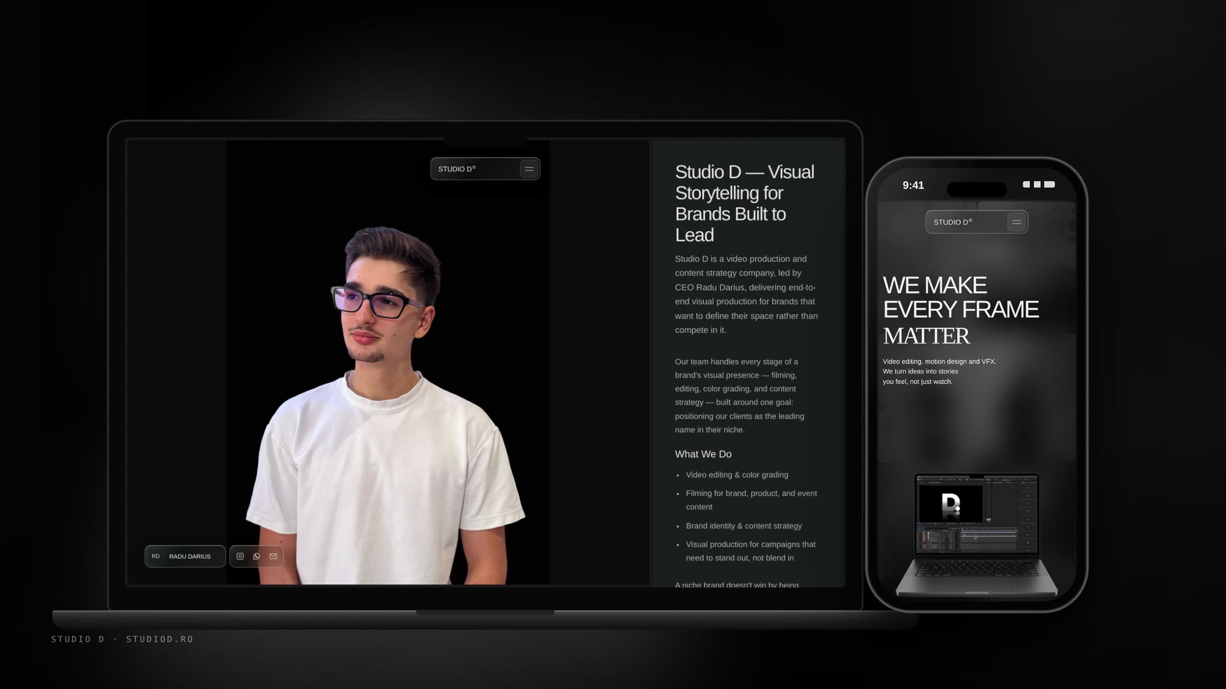
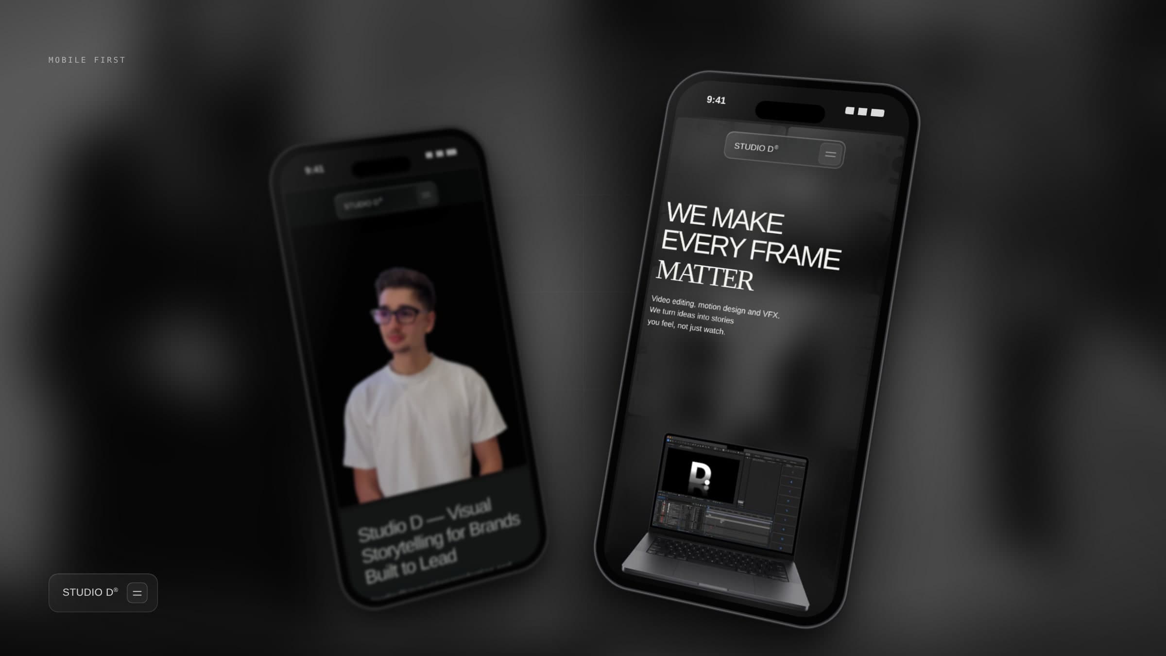
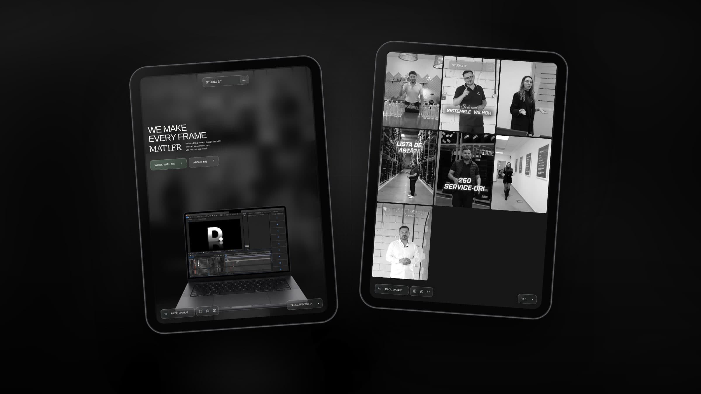
We designed a dark, high-impact one-page experience in Framer — bold typography, high contrast, and a structure that guides every visitor from problem to solution without friction. Each section was written and designed to reflect Studio D's core values: fast delivery, clear communication, and zero filler.
Beyond the visual layer, we built two functional systems that elevate the site above a standard portfolio. A custom-coded monthly investment calculator lets potential clients self-qualify by selecting services and video volume — arriving at the contact point already informed and ready to commit. A Sanity CMS integration powers the Happy Clients section, giving the client full control to add testimonials and showcase new work in minutes, without touching a line of code.
The result is a service website that works as hard as the person behind it — sharp enough to stop the scroll, smart enough to handle the rest.
Visuals
(06) Frames
Key Challenges
Building a service website for a video editor means the site itself has to prove the point — fast, sharp, and impossible to look away from. For Studio D, the challenge was to design a digital presence that converts on first impression while delivering real technical infrastructure behind it.
(04) Challenges
Designing a landing page that mirrors the energy of high-retention video content — every section paced, structured, and built to hold attention from the first scroll.
Beyond the visuals, a custom pricing calculator and a Sanity-powered testimonials system turn the site into a working business tool, not just a pretty page.
The visual language borrows from the content it sells — high contrast, bold typography, and zero wasted space across every section.
With Sanity CMS managing social proof and new work, Studio D's site stays fresh and credible without touching a single line of code.
Design Approach
Our approach was built on one belief — if the site doesn't feel as sharp as the edits it's selling, nothing else matters.
(03) Directions
We built a dark, high-impact landing page that captures attention in the first three seconds — because that's exactly what Studio D promises to do for every client.
A custom-coded monthly investment estimator lets visitors self-qualify and understand the value before they ever hit contact — arriving convinced, not just curious.
By integrating Sanity CMS into the Happy Clients section, Studio D can add new testimonials and showcase new work instantly — no developer, no delay.
Final Outcome
The result is a service site that works as hard as the person behind it — sharp enough to stop the scroll, smart enough to handle the rest.
Next project
Alexandra CăpitănescuGet in touch